
Wayfinding for Northwich
A human-centred navigation system designed to reduce confusion, restore confidence, and reconnect people with place.
Overview
Northwich is changing fast. New developments, shifting infrastructure, and a growing town centre have created a disconnect between people and place. What should feel navigable instead feels fragmented.
This project reimagines wayfinding for Northwich through a fully integrated, human-centred system, designed not just to direct people, but to help them feel grounded, confident, and in control of their journey.
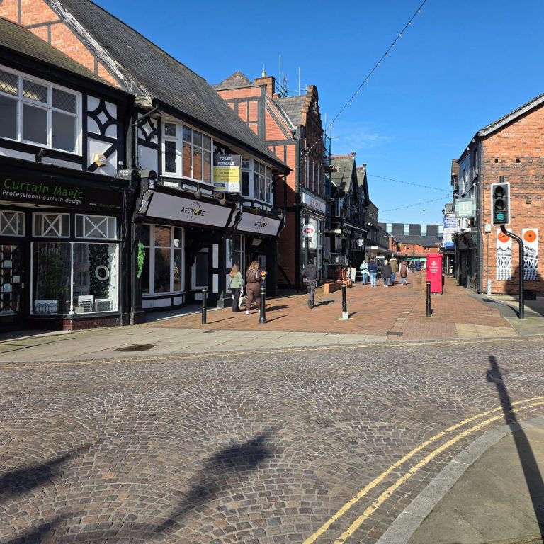
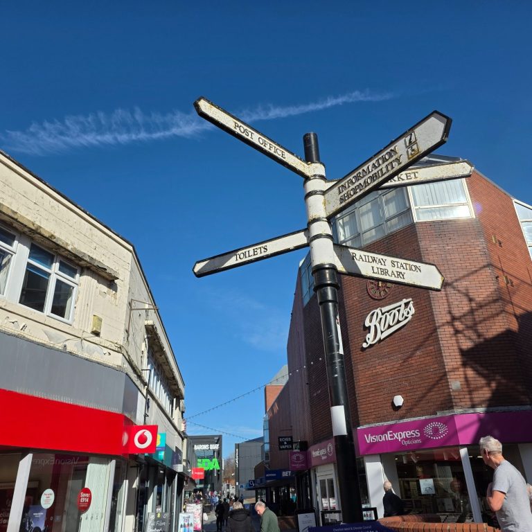
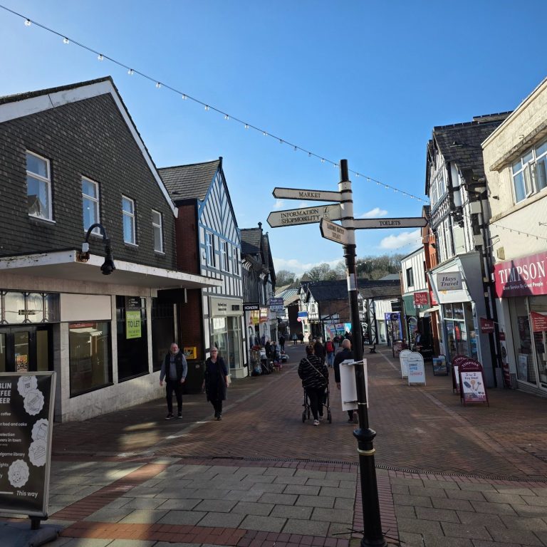
The Problem
The existing wayfinding across Northwich is inconsistent, outdated, and in some cases, completely absent. Signage points to places that no longer exist, key junctions lack direction entirely, and newer developments feel disconnected from the historic town centre.
Through observational research, it became clear that people weren’t just getting lost, they were hesitating, second-guessing, and relying heavily on their phones to navigate even simple routes.
Wayfinding wasn’t supporting people. It was failing them.
Approach
This project is rooted in human-centred design. Not assumption, but observation.
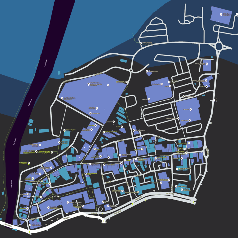
I studied how people actually move through Northwich. Where they stop. Where they hesitate. Where they check their phones. These “decision points” became the foundation of the system.
From there, I analysed established systems like Legible London and Birmingham’s Interconnect to understand what works at scale, then translated those principles into something specific to Northwich.
The goal wasn’t to copy. It was to adapt, localise, and humanise.
The Idea
Wayfinding should do more than direct. It should orient, reassure, and invite exploration.
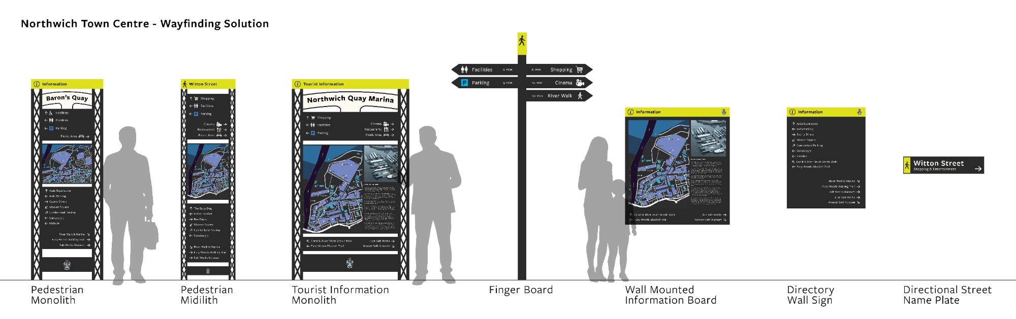
The system introduces a cohesive network of:
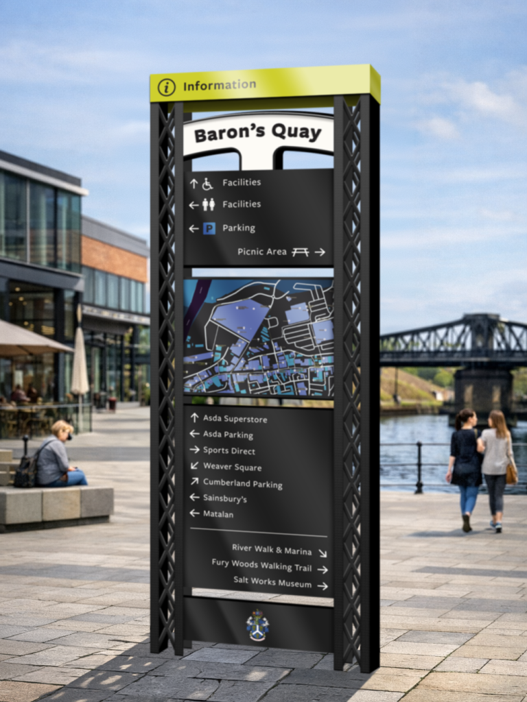
- Monoliths (primary navigation points)
- Midiliths (secondary guidance)
- Fingerpost signage (quick directional cues)
- Mapped touchpoints (physical + portable)
Each element is placed intentionally at key decision-making locations, supporting people exactly when they need it.
Design Language
The visual identity draws directly from Northwich itself.
Black and white forms reference the town’s Tudor architecture and iron bridge structures, grounding the system in its environment rather than layering something artificial on top.
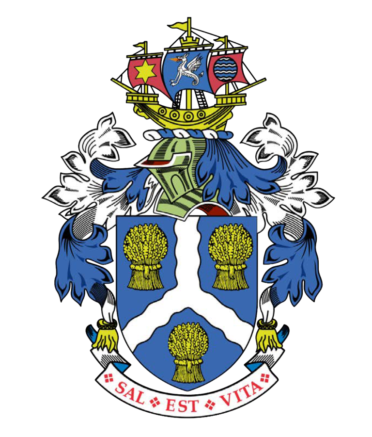
Accent colours are taken from the Northwich Town Council crest, creating a recognisable and ownable visual language across all touchpoints.
Typography is clear, humanist, and accessible — designed for readability in motion, not just aesthetics.
This isn’t signage placed in a town.
It’s signage that belongs to it.
Key Decisions
- Heads-up mapping to match user orientation and reduce cognitive load
- Placement at natural hesitation points, not arbitrary locations
- Consistent visual hierarchy across all formats
- Scalable system that can grow with the town
- Accessibility considerations, including potential for voice-assisted information
Every decision was made to reduce friction and increase confidence.
Outcome
The final result is a fully realised wayfinding system that connects the old and new parts of Northwich into one coherent experience.
More importantly, this project has moved beyond concept.
Interested parties are now considering the system for real-world implementation, and the project has opened up ongoing conversations and potential future work.
Reflection
This project reinforced something simple but often overlooked:
Good design isn’t about making things look better.
It’s about making things work better — for real people, in real situations.
By focusing on behaviour rather than assumption, I was able to design a system that doesn’t just guide movement, but reduces anxiety, builds confidence, and encourages exploration.
And that’s what wayfinding should do.
Contact
Contact Details
Telephone: +44 7376 028 074
E-mail: rachel@studiocinami.co.uk
Northwich, Cheshire.